Create bootstrap like columns using css grid
May 27, 2020
Create responsive columns
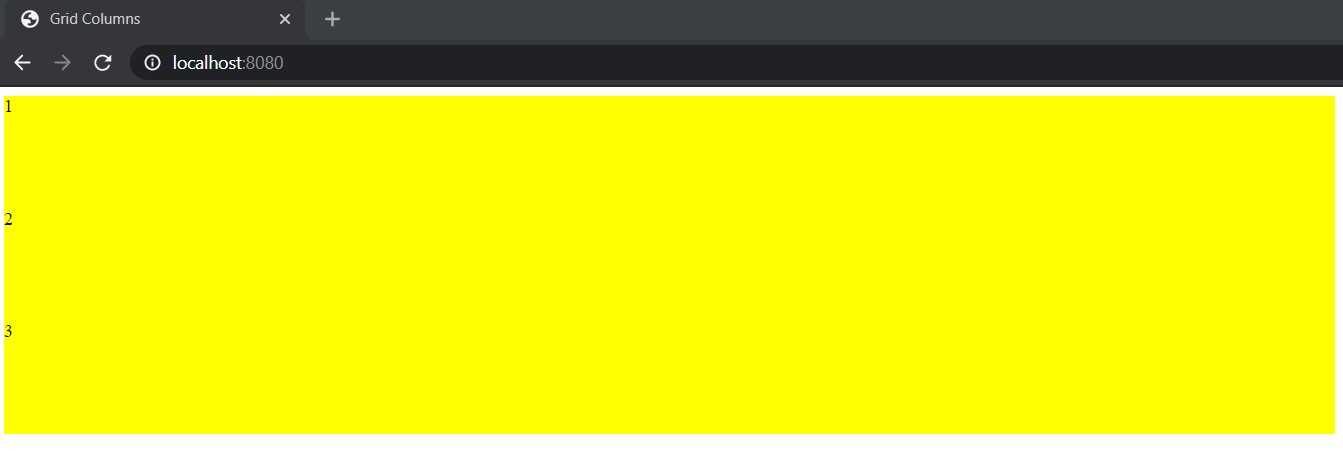
Create a container and three children. These three children each will occupy 33% available width. We are going to use css grid to create this columns like structure. We are adding background and height to make better visual comparison.
 <div class="container">
      <div class="item">1</div>
      <div class="item">2</div>
      <div class="item">3</div>
    </div>

<style>
.item {
    height: 100px;
    background: yellow;
}
</style>
So it will look like this.
 Before we make changes, we are going to write some small tests to validate our efforts. This will allow us to automate checking that everything is as expected, instead of manually reloading the page every time we make a change to ensure nothing broke. We will use cypress for these examples, a common dom tester.
it('Should have a div width of 33%', () => {
  cy.get('.container').then($container => {
       cy.get('.item').then($item => {
            expect($item.width()).to.eql($container.width() / 3);
        })
  })
});
This grabs the first item in the container ,and confirms that the width of the item is one third of the container. This test should fail showing us that the item's width is the same as the container's.
Let's add display:grid property to the container to make the test pass. We will use grid-template-columns property to specify children responsive widths.
.container {
    display: grid;
    grid-template-columns: auto auto auto;
}
Now three-item children each should take 33% width available on the screen. Make sure to match the number of children and their width in grid-template-columns. The width taken by children is responsive. So it will be relative to their parent width. It will take the respective % width available to their parent element.
Now it will look like this -
Using grid-template-columns you can specify number of columns and their widths for a grid container element. What if you want to add some gap between those columns without specifying external margin ? Let's modify our test and then we can use grid-gap for that.
it('Should have a div width of 33% minus the gap', () => {
  cy.get('.container').then($container => {
      const gap = parseInt(Cypress.$('.container').css('grid-gap'));
      const totalGap = $container.children.length * gap;
      cy.get('.item').then($item => {
           expect(Math.round($item.width())).to.eql(Math.round(($container.width() - totalGap) / 3));
      })
  })
});
Here, we pull the gap value from the css, then use that to calculate the expecting width. We are rounding the values to deal with floating point discrepancies, since we don't care about fractions of pixels. Let's add 20px gap between these columns.
.container {
    display: grid;
    grid-template-columns: auto auto auto;
    grid-gap: 20px;
}
Now it will look like this -
CSS grid is a powerful feature to create complex responsive layouts. We don't need special library to create responsive layouts if we take advantage of features like CSS grid and flexbox.

